DA
Fictitious rebranding of Intel – A rethought visual identity like in 2005, blending technological modernity and retro graphic codes.

Context
This project consists of reimagining Intel's visual identity as if it had been redesigned in 2005. The goal was to modernize the brand while incorporating the graphic trends of that time: bold gradients, 3D effects, and expressive typography.
Role
Art Direction: Research and analysis of design trends from the 2000s.
Graphic Design:
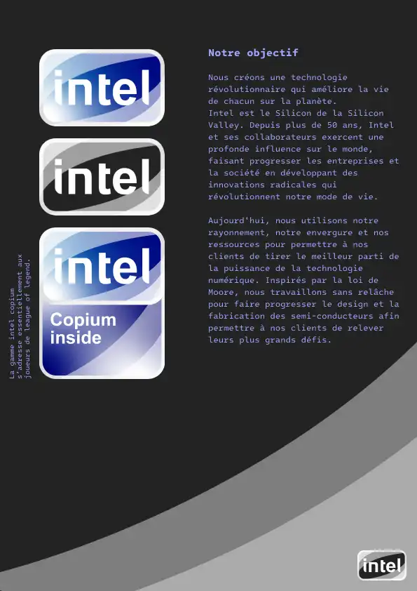
Redesign of the logo and its variations (e.g., "Copium Inside").
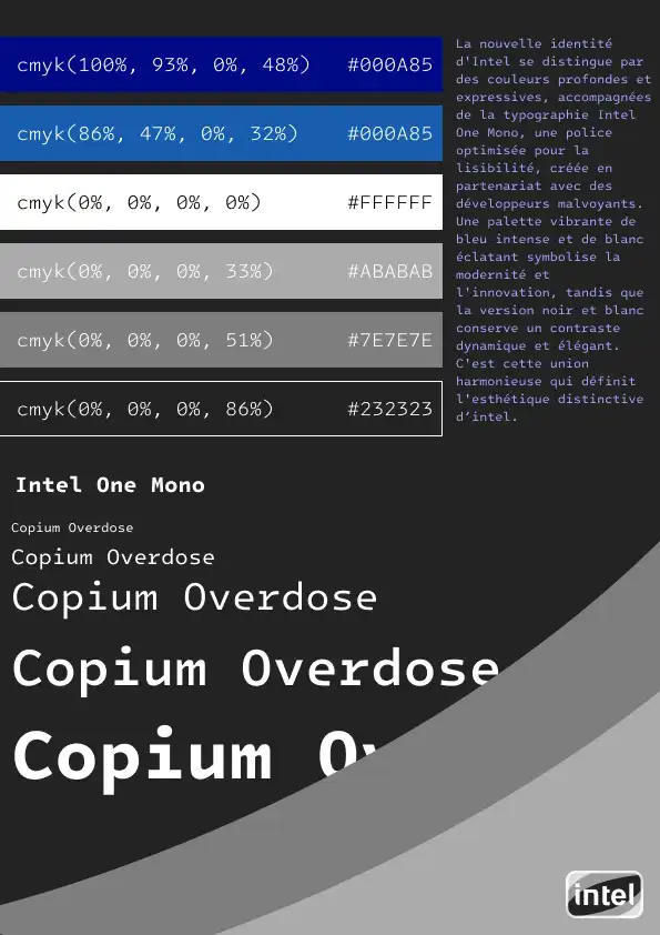
Creation of a complete graphic charter (colors, typography, patterns).
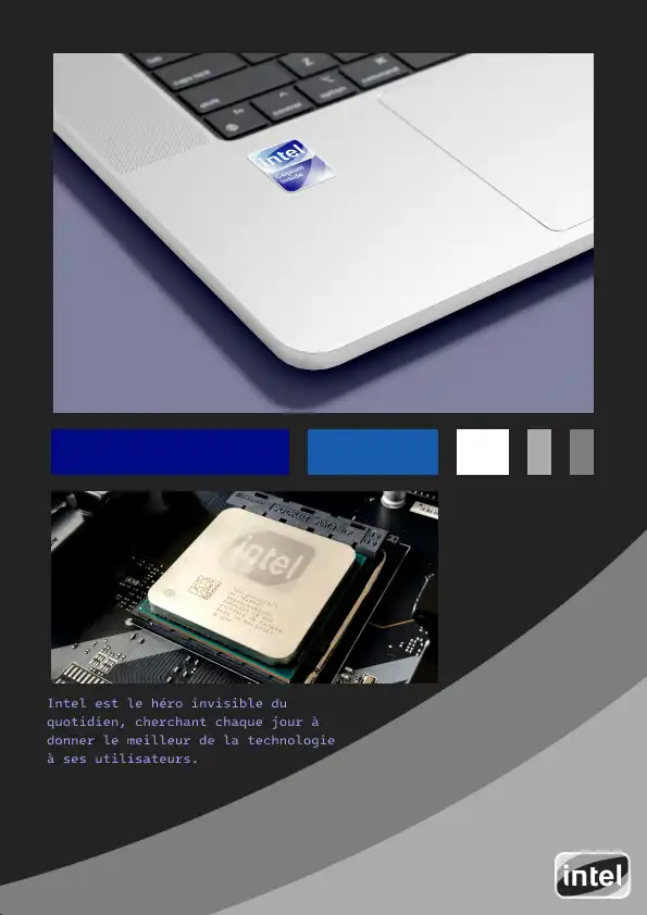
Design of visual applications (stickers, posters, digital media).
Visual Identity: Development of a coherent universe inspired by the technological and futuristic aesthetics of the 2000s.
Inspirations and Creative Choices
Colors and Typography: Electric blue gradients, vivid contrasts, and the typography "Intel One Mono" evoke the emerging digital era of the 2000s. Saturated CMYK colors and transparency effects enhance the high-tech and dynamic aspect.
Logo and Variations: The logo has been rethought to evoke power and innovation, with variations adapted to different media (stickers, posters, website). The idea was to maintain the brand's instant recognition while adding a retro-futuristic touch.
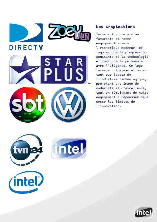
Graphic Universe: The visuals are inspired by the codes of technological brands of the time (e.g., DirectTV, Volkswagen), while maintaining a unique and modern identity.
Result
A visual identity that combines nostalgia and innovation, recreating the spirit of Intel as it might have been interpreted in 2005. This project shows how an iconic brand can evolve while staying true to its DNA, all with a touch of retro creativity.